
Take “yes” for an answer
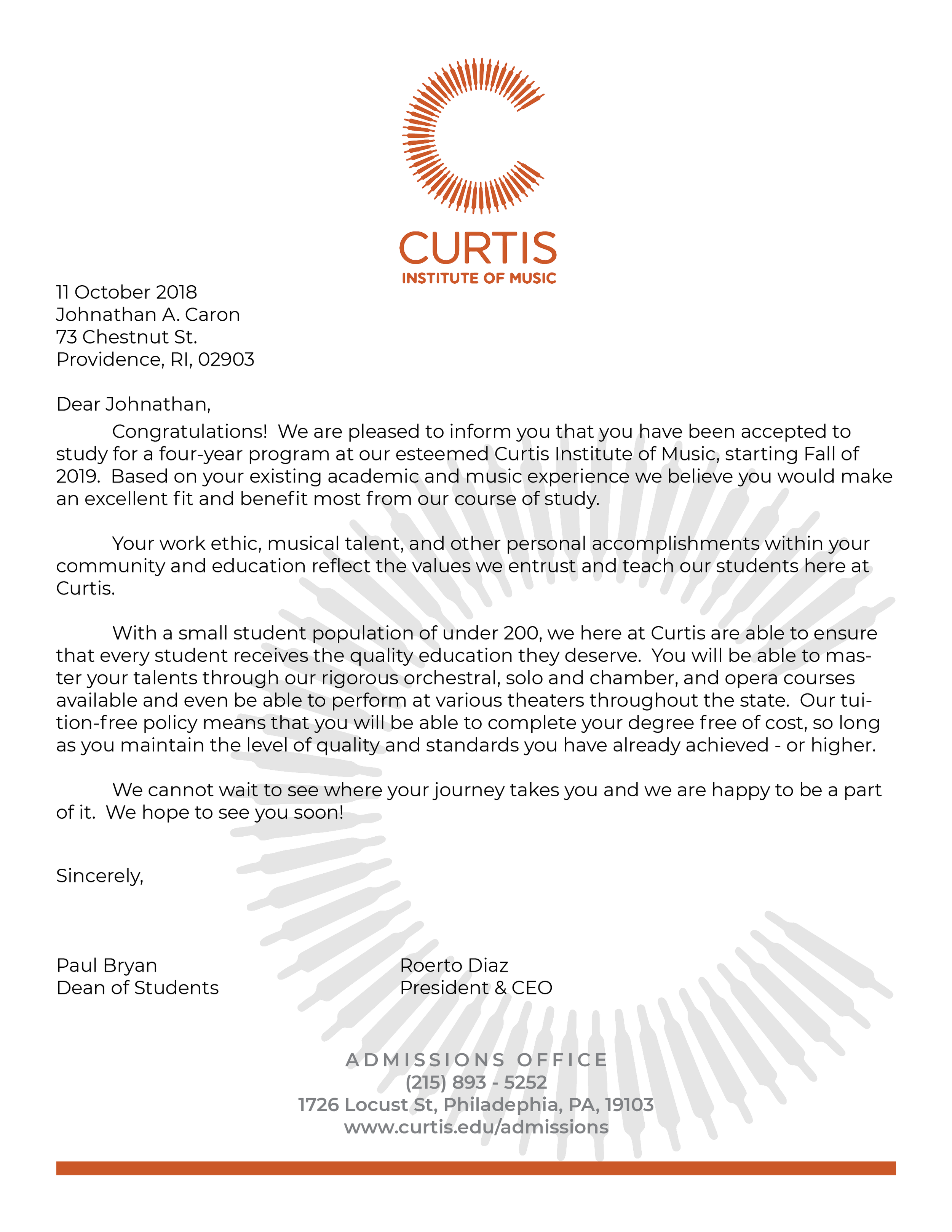
There’s not really any special story for this one. College work, make an acceptance package for a university. When I was in high school I was considering a career in music, following ~12 years of playing. I ended up pursuing something else, but my brother followed in my footsteps and also was into music for quite a while! Until he also pursued something else in university. So I figured I would pick a music school, and went with Curtis.
For the most part, I just had fun with this one. I had my brother and his friend pose for photos, had the opportunity to play around with two of my favorite colors, and create some music! One of the reasons I chose Curtis was because, at the time, they had very few branding guidelines which meant I had a ton of room to just kind of do whatever I thought would be good.
At the time I wasn’t much of a physical crafts person, and so the actual boxes and stuff didn’t come out great - but I’m very happy with the designs. Years later turns out I would become a physical crafts person, if only I could go back in time and give younger me that same passion.
For any music lovers looking at this, I had way too much fun using music notations for hidden meaning in this project. I don’t know how well they hold up because I know what they mean, but it’s a fun little piece of this project. Can you figure them all out?


Project Title
Year(s)
Client(s)
Work Type(s)
Curtis Acceptance Package
2018 - 2019
College Work
Design, Photography, Editorial Layout, Package Design


